CSS Clip Path Generator
Create custom CSS shapes instantly with our free visual Clip Path Generator.
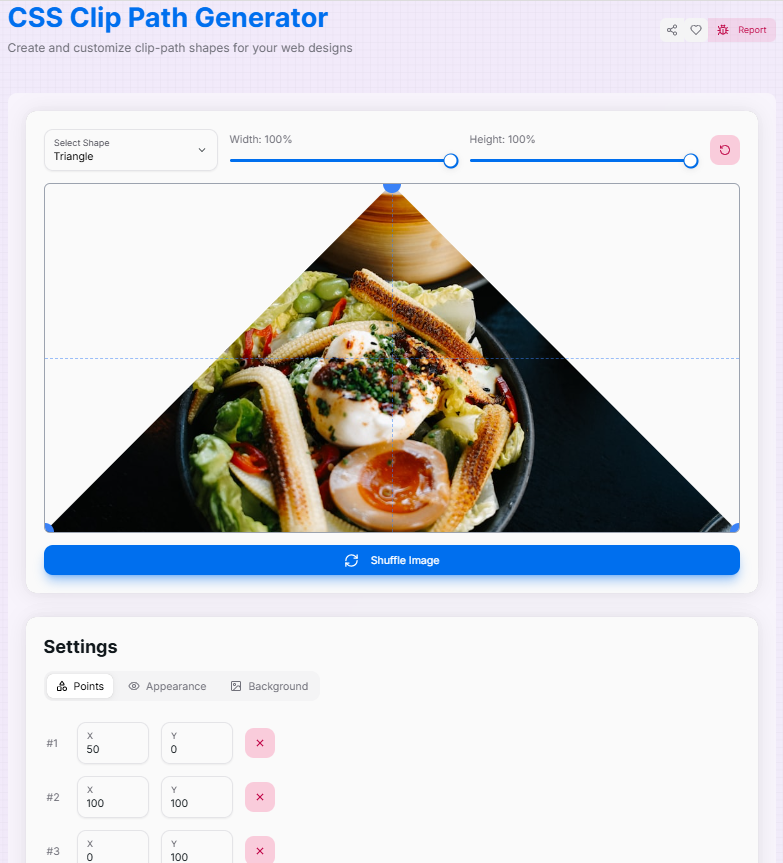
Width: 100%
Height: 100%

Settings
Generated CSS
Copy this CSS and apply it to any element you want to clip. The clip-path property is supported in all modern browsers. The -webkit- prefix is included for maximum compatibility.
What is the Clip Path Generator?
Imagine that you are a digital artist with a magical pair of scissors who can cut any shape from an image. That is essentially what our Clip Path Generator does! It is a fun and spontaneous tool that allows you to make a custom shape to reveal parts of an image while hiding others.
Whether you are a web designer looking to add some flair to your site or a developer trying to create unique UI elements, this tool is your new best friend. Convert boring rectangles into exciting polygons, turn square profile images into perfect circles, or create complex custom shapes that bring your creative vision to life. It is like being a digital surgeon with a knife that is never sluggish!
How to Use the Clip Path Generator?
- 1Select & Sculpt:
Head over to the Shape tab to pick a base shape, or use the custom option. Drag the control points directly on the image to sculpt your perfect form.
- 2Refine Settings:Dimensions & Opacity:Adjust the width and height sliders, and modify opacity for transparency effects.
- 3Visualize:
Toggle "Show Outside" to see the clipped area, use "Hide Guides" for a clean view, or upload your own background image to see how the shape fits your content.
- 4Export:
Once satisfied, copy the generated CSS code instantly for use in your project. You can also use the "Reset" button to start fresh.
Features That'll Make You Go "Wow!"
Pro Tips
Experiment
Don't be afraid to drag points wildly! You can always hit the "Reset" button to start fresh if things get too abstract.
Layering
Combine clip-paths with CSS filters or overlapping elements to create depth and modern UI effects.
Compatibility
Clip-path is widely supported, but always check your target browser requirements for complex polygon shapes.
So, what are you waiting for? Dive in, start clipping, and let your creativity run wild! Who knows? You might just create the next big thing in web design.
More CSS Tools
CSS Background Pattern Generator
Create beautiful CSS background patterns with our interactive generator.
CSS Cubic Bezier Generator
Create smooth, custom easing functions for your CSS animations with precision and ease.
CSS Box Shadow Generator
Create and customize complex CSS box shadows with precision and ease.
CSS Flexbox Generator
Create, visualize, and customize flexible layouts using CSS Flexbox with precision and ease.
CSS Gradient Generator
Create beautiful, customizable gradients using CSS with advanced options and features.
CSS Loader Generator
Create customizable CSS loaders for your web projects.