CSS Flexbox Generator
Create, visualize, and customize flexible layouts using CSS Flexbox with precision and ease
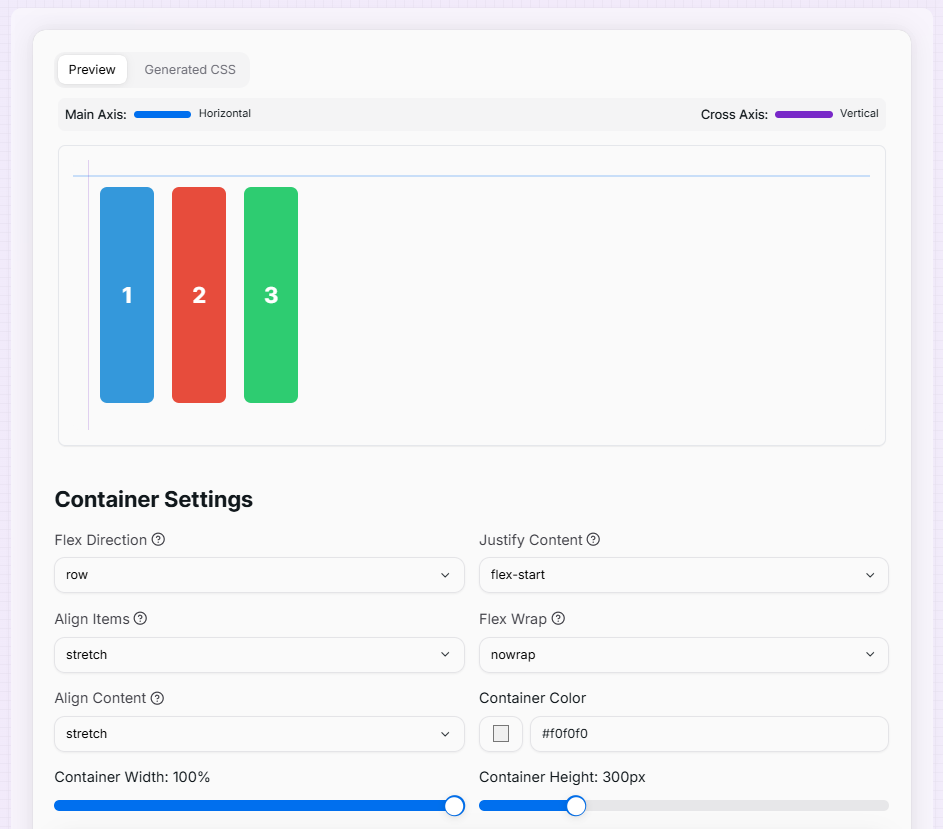
Container Settings
Item 1
Item 2
Item 3
What is the CSS Flexbox Generator?
Think of the CSS Flexbox Generator as the Swiss Army Knife for modern web layouts. In the past, aligning elements in the center or creating equal-height columns was a nightmare for developers. Flexbox solved this, and our generator makes that power visual and intuitive.
This tool allows you to act as a layout architect, arranging "flex items" within a container with absolute precision. Whether you are building a responsive navigation bar, a centered landing page hero, or a complex grid of cards, you can experiment with alignment and spacing properties in real-time and see the code update instantly.
How to Use the CSS Flexbox Generator?
- 1Configure the Container:
Start by adjusting the Flex Direction (Rows/Columns), Justify Content, and Align Items. This determines how all items behave collectively inside the parent box.
- 2Manage Flex Items:Add & Individualize:Add or remove items using the controls. Click on an individual item to adjust its Flex Grow, Shrink, or Align Self properties for unique positioning.
- 3Visualize Dimensions:
Customize container width, height, and background colors. Toggle Gap sliders to see how spacing works between items without using margins.
- 4Copy the Code:
Switch to the Generated CSS tab to inspect the clean code. Copy it with one click and paste it directly into your project's stylesheet.
Key Flexbox Features Explained
Pro Tips
Main vs Cross
If your direction is row, the main axis is horizontal. If it's column, the main axis is vertical.
Flex-Basis
Think of flex-basis as the "ideal" size of an item before the remaining space is distributed.
Flex-Grow
An item with flex-grow: 2 will take up twice as much available space as an item with flex-grow: 1.
Ready to build pixel-perfect layouts? Start adjusting the properties above, watch how the items react, and master the art of Flexbox in minutes!
More CSS Tools
CSS Box Shadow Generator
Create and customize complex CSS box shadows with precision and ease.
CSS Cubic Bezier Generator
Create smooth, custom easing functions for your CSS animations with precision and ease.
CSS Background Pattern Generator
Create beautiful CSS background patterns with our interactive generator.
CSS Clip Path Generator
Create custom CSS shapes instantly with our free visual Clip Path Generator.
CSS Gradient Generator
Create beautiful, customizable gradients using CSS with advanced options and features.
CSS Loader Generator
Create customizable CSS loaders for your web projects.